Linear Thinking...Expand A Dining Room With Stripes
Dining rooms are meant to welcome your guests with open arms. One element that creates this feeling is to give the impression that there is plenty of room for EVERYONE.
Designer, Debby Hall utilized “linear thinking” with horizontal stripes to develop the illusion that this space is larger than it appears.
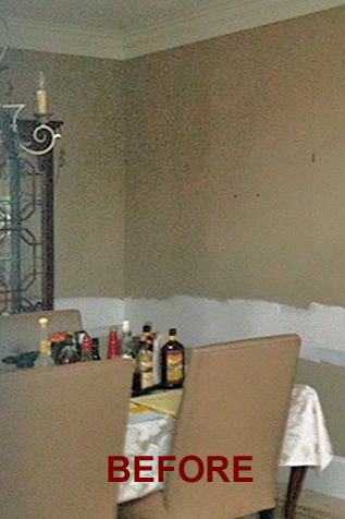
Before
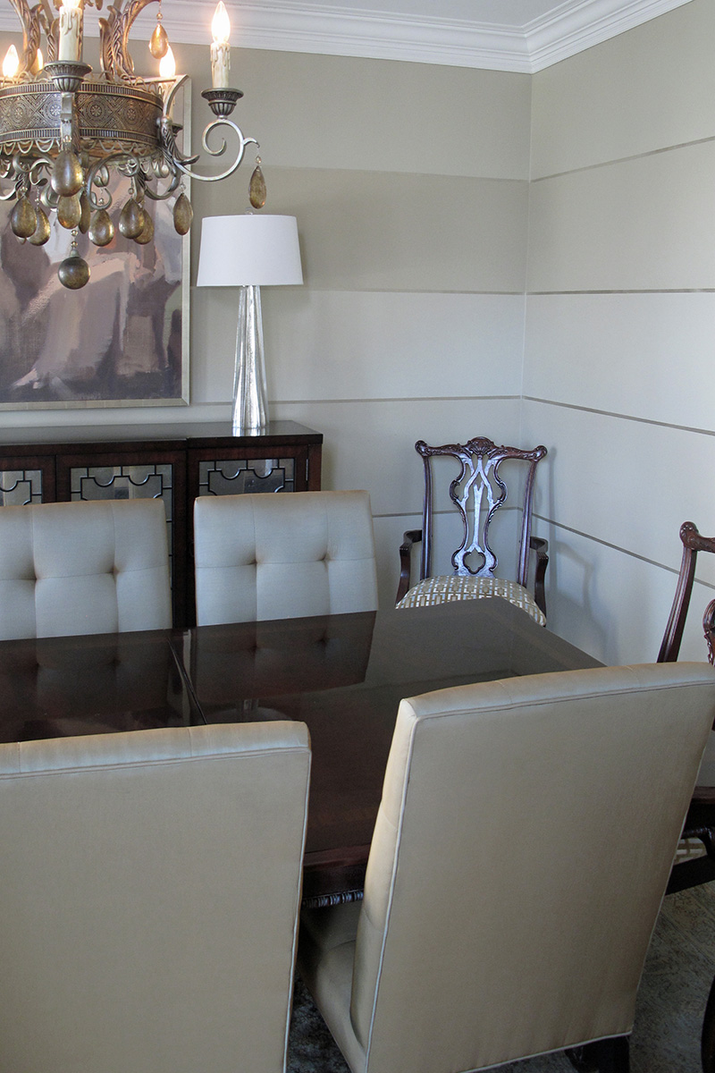
After
The Design Process
There are few patterns as timeless and classic as stripes. To make them current, they were done in a large scale proportional to the room and turned horizontally. The use of subtle colors and a tiny stripe of metallic taupe emphasized the elegance and formality that the client desired. Note how each line is in perfect unison with the accessories to compliment the length of the table.
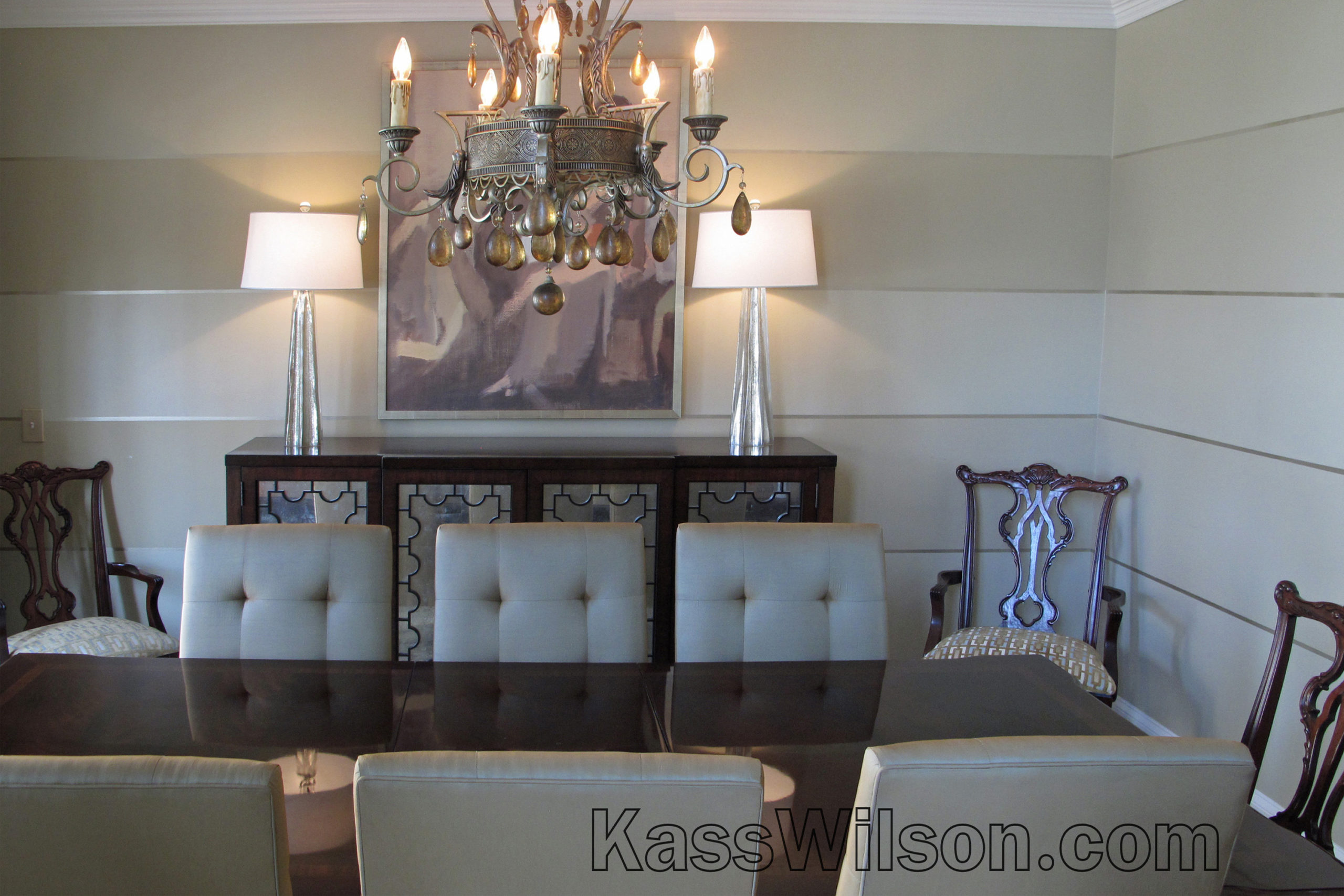
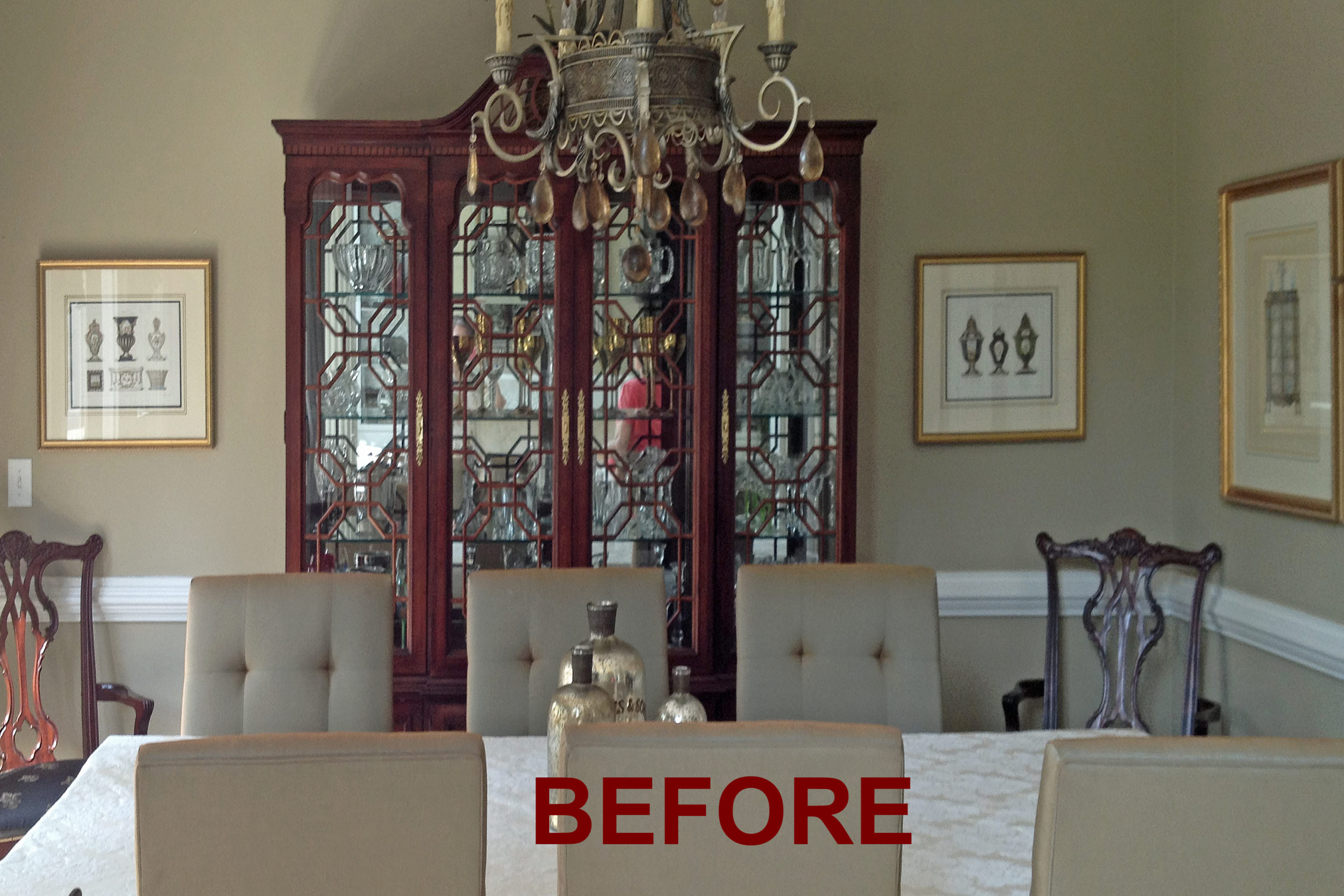
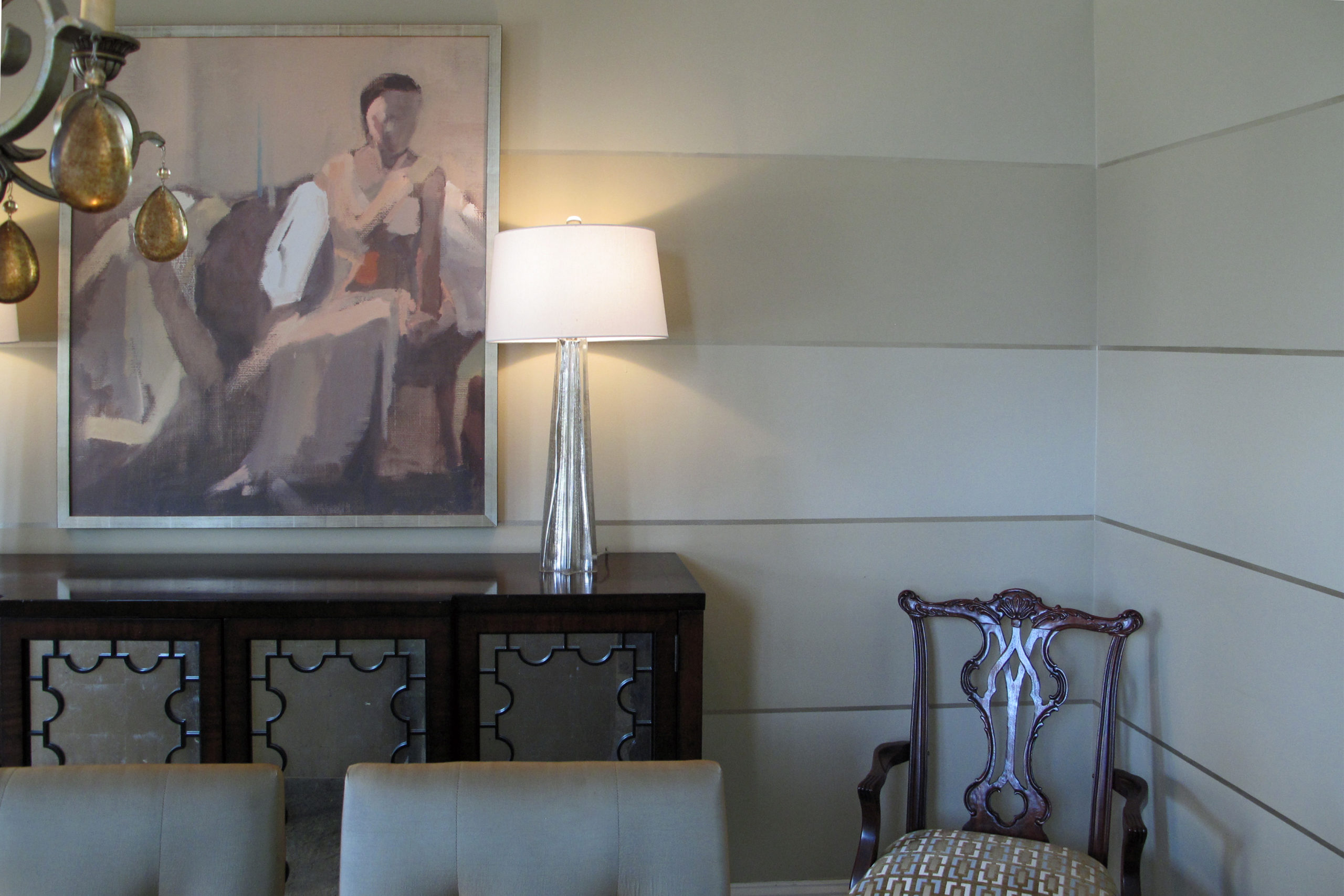
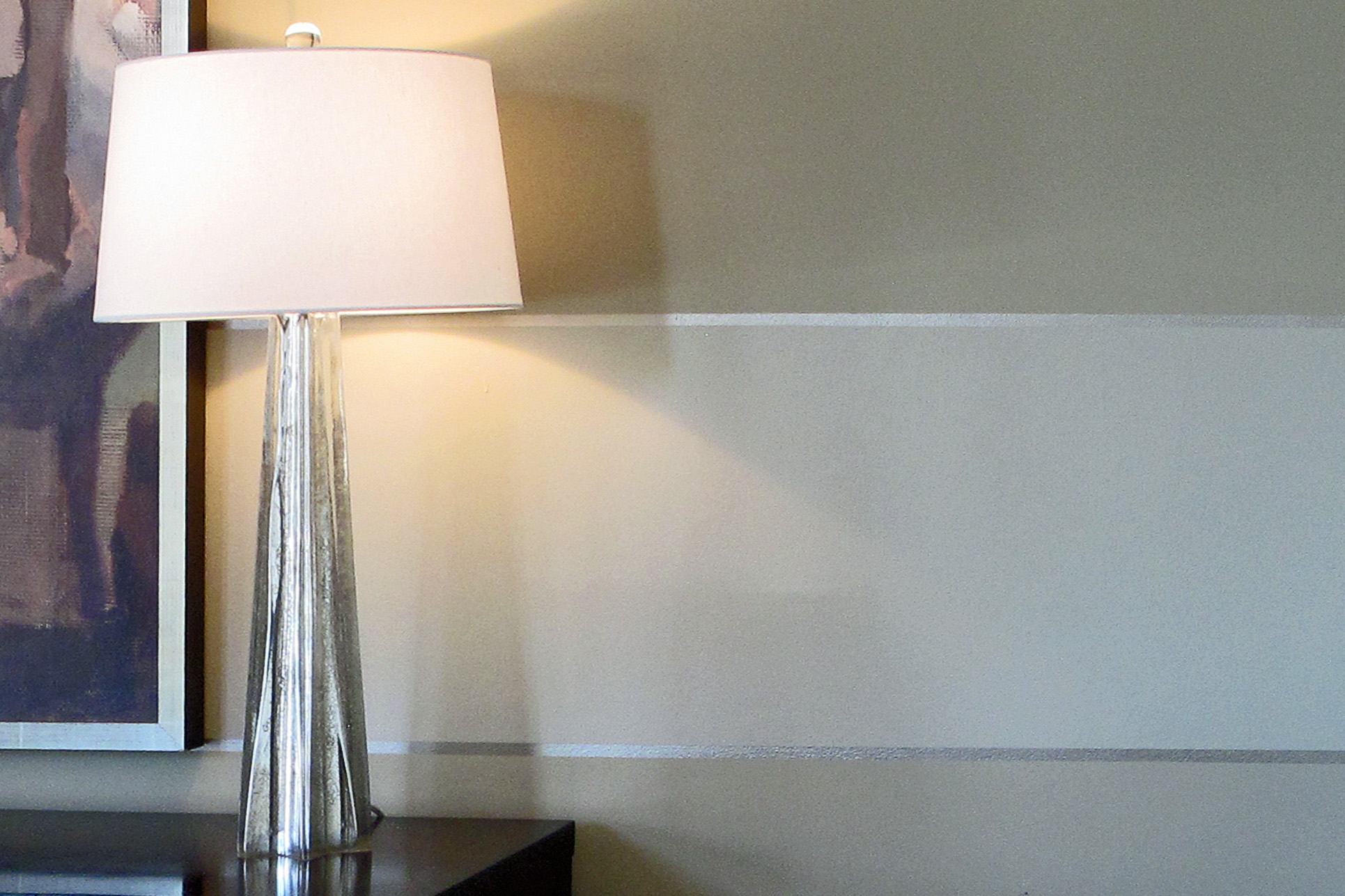
Replacing the china cabinet with a low console provided another long uninterrupted line across the expanse of the largest wall. Horizontal stripes have the ability to punctuate artwork and furnishings while redirecting the eye to make a space seem larger. Ultimately, this room now offers plenty of space for an updated traditional dining experience.
Designed by:
Debby Hall
www.debbyhall.com
Hall & Company Interior Design Inc.
770 757 1216
